Mogool Bikes
logo redesign, branding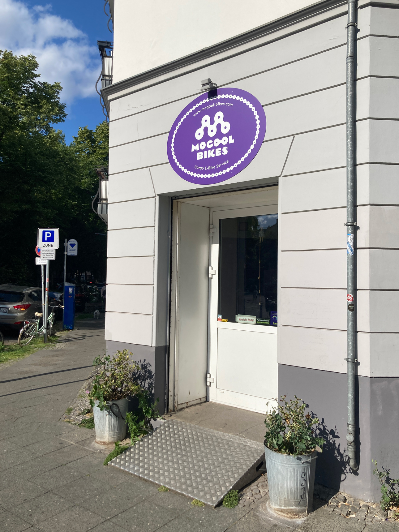
The new owners of Mogool Bikes wanted to modernize the existing logo. They liked the concept of the original, but wanted to give it a more coherent and contemporary feel.

The M is composed of chain links, as in the original logo, but has been made bolder and friendlier. The two Os in Mogool are joined to form a chain link, echoing the logomark and creating a visual connection between the wordmark and the symbol.
Together with the clients, we chose a colour that would stand out among Berlin’s bike shops while giving the brand a fresh and energetic feel. I also prepared light branding guidelines for the use of colours and fonts across their website and other materials, helping to create a consistent overall image.
